When we created the Windows 8 logo design contest, we were on the lookout for a viable contender to Microsoft’s much debated official Windows 8 logo. After receiving 700 entries, some of them were bound to be entertaining. We couldn’t let the creativity go to waste so we’re holding another contest to award the designer who created the most amusing alternative Windows 8 logo.
Simply vote for the logos you like best by clicking their respective tweet button. The winner will receive $150 and be chosen based on general buzz. Voting ends March 31 2012. Of course this contest (just like the previous) is just for fun. We do not represent Microsoft in any way shape or form. 🙂
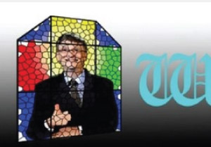
Stained Glass Bill Gates by David Nieuwstad
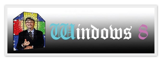
Windows 8 marks the point where computers are no longer separated from the individual, but fluidly become an extension and a part of the individual. Never has the name Windows been so appropriate: our computers in any shape and size have become multi-facetted windows through which we reach out to the world and through which we can see our own personalities reflected. Clear, clean, and even physically speaking, glass is a “fluid”. Soon the operating system (and any operating system for that matter ) will evolve itself out of sight as it integrates with our bodies and minds. There will be no more awkward frames, no posh gradients, no waving or disintegrating flags, or any poorly chosen bombastic CGA rendered typefaces. Just a stained glass William Henry Gates III KBE (soon to be saint) smiling kindly at us, as he knows that the term vaporware is finally becoming appropriate.
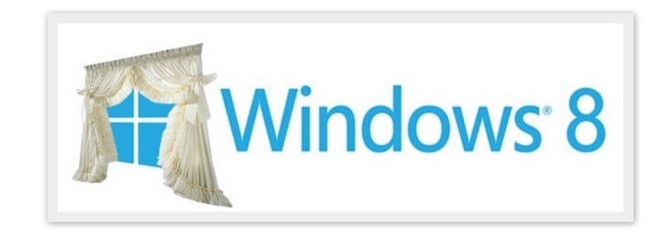
Close the Windows 8 Curtains by “Aardvark21021”
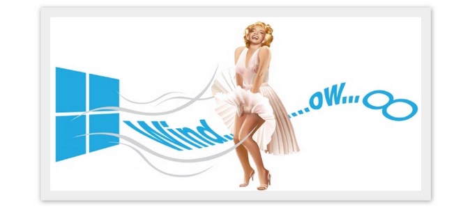
Wind + Ow by “Kurniawana”
!function(d,s,id){var js,fjs=d.getElementsByTagName(s)[0];if(!d.getElementById(id)){js=d.createElement(s);js.id=id;js.src=”//platform.twitter.com/widgets.js”;fjs.parentNode.insertBefore(js,fjs);}}(document,”script”,”twitter-wjs”);
Windows is software that can be enjoyed by all people without class restrictions. It reminds me of the “pop art” which uses symbols to fight high class art which is typically only enjoyed by the upper classes.
In this logo, I used two popular symbols: The Windows symbol and Merlyn Monroe.When everyone thinks of Merlyn Monroe, we are reminded by the wind flapping her skirt up. So from this, I created the formula: ( WIND + OW x 8 = WINDOW 8 ) The “Ow” in the formula is sound she made when her skirt started blowing. I did not really have a goal when designing the logo because it was done just for fun. I just wanted to show the depiction of “Windows” as software which can be enjoyed by all people without class restrictions.
Window Peek by “Dani_Dani”
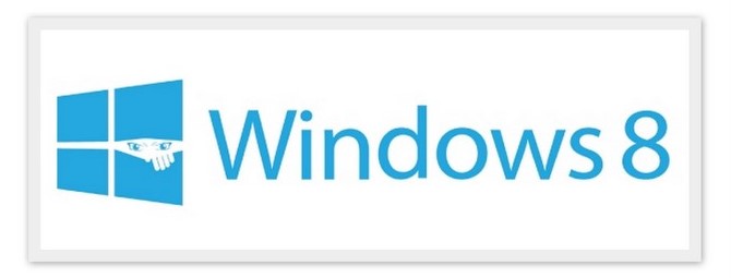
My name is Mohamed and I live in Morocco. I’m 24 years old and I have been freelancing for about 3 year as well as studying to become an industrial engineer. Today, there is a lot of censuring of data which I believe is being done by leaders who repress our rights of freedom of speech and thinking by spying on people. The Windows logo gives a good opportunity to express this concept since a window is traditionally transparent.
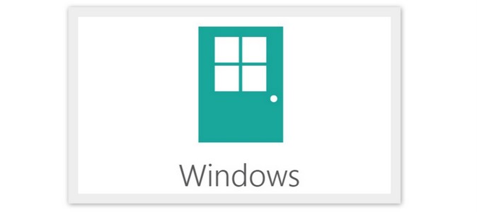
Windows 8 Door by Tak Min Yang
My name is Tak Min Yang and I’m a multimedia designer from Malaysia. Microsoft is shifting away from Windows so what else could be more appropriate then a door?
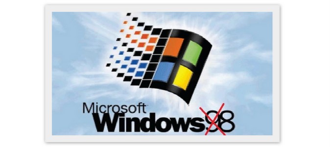
Not Windows 98 By “Icha007”
Never Ending Windows Sequel By Otto Gierling
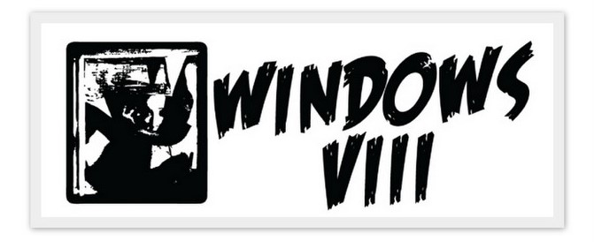
My name is Otto Gierling and I’m a 45 years old programmer, web designer and ‘artist’, living in the southwest of Germany, near France. I started with computers when I was 14. A great thing about learning computers so young is that I can still use what I learned as a teenager, today. Just have to shift the same old bits around.I’m a fan of Open Source, and I always have to smile when Apple/Microsoft announce a “great” new feature but the Windows GUI (along with Apple’s OS X) are old. They seem to be an endless story (sequel VIII). What I wanted to express is my feeling that there was no great invention or fundamental new ideas in computing. Instead the buzz word is “Consumerization of IT”.
Windows 8 ball by “Spezies”

It’s my little sarcastic idea to use the 8 billiard ball as a part of the logo. If you know pool, you know that the 8 is the last ball at the table and no other number will come after that. So, I used the billiard ball to represent the last version of Windows which has the old style of logo (and possibly the end of windows all together!) The metro style tiles will not rescue the old idea of Windows.
Windows NT 6.2 by Matt A. Tobin
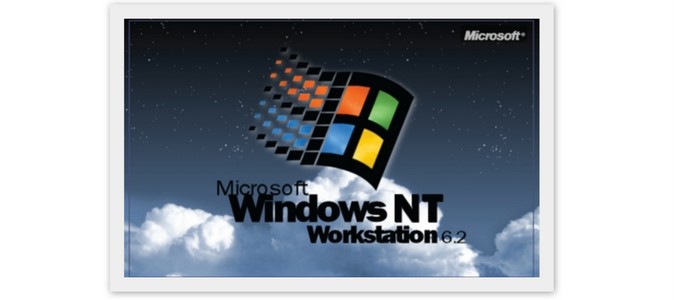
I was born in 1985 but I consider myself a true child of the 90s. With the branding of Micorosft products becoming mainstream and unified, I longed for the days when branding could be fairly unique to the product. I also have had an affinity for the NT versions of Windows. Dumping 9x for Windows 2000 the first chance I got. Honestly this is about nostalgia mostly. NT4’s branding was a take on Windows 95’s branding but different because in reality NT and 9x are different. My goal was to imagine what NT4 style branding would look like today if the trend stayed close to the same lines. What I mean is to bring that classic branding into a high quality form. ‘
This particular design was an outgrowth of wallpaper I created for Windows 7. That original wallpaper was made from the highest quality version of the Windows flag that I painstakingly cut out of an official Microsoft. I then created a version of the NT4 wallpaper (which it’s self is in the style of a splash screen) to compliment it. This particular version is a simple modification of that.
I enjoy the classic branding and enjoyed seeing it evolve as I grew up. It saddens me that they abandoned it so easily but the new Windows logo is in line with what they are trying to do – innovate instead of evolve. It really is too bad that innovation comes at a heavy price for anyone who can be considered an enthusiast or power user. This work was created by Matt A.Tobin of Binary Outcast
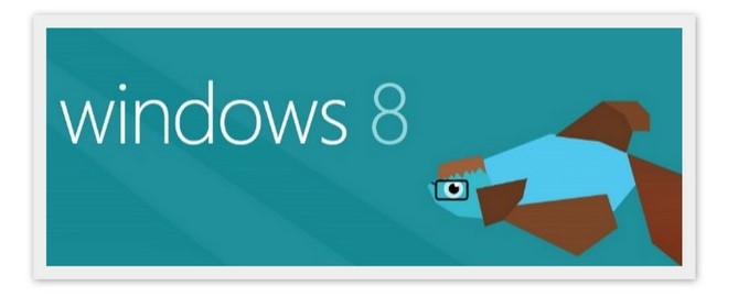
Windows 8 Beta Bill Fish By “MetroUI”
Windows Inspired by Apple by Carl Goldson
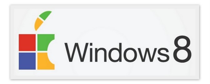
The inspiration behind this is Apple. Apple has always been Windows’ main rival and I think if they could get away with it, Windows would give in and use this logo.
Windows 8 Literally by Jay Machalani
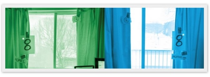
As you can see in the picture, my computer is right beside my room’s window. I said to myself “Why not take a window and just put the actual number on it?” And there you go, Windows 8! I laughed a bit, but I decided to actually take a real picture of that idea since it would be even funnier. This contest was a great opportunity to stop and ask yourselves some important questions about brand identity and the right balance between preservation and evolution.
So there you have it – some of the more amusing entries in our Windows 8 logo contest. Which one do you think is the best? Leave your comment below:

I’d go for Windows8Literally – whenever I see it, it makes me smile.
I’m afraid the others don’t have the same effect.
So… what happens with this?